How Well Can You Read Graphs and Charts?

By: Kennita Leon
Estimated Completion Time
5 min
How Well Can You Read Graphs and Charts?
Image: Wiki Commons Various

About This Quiz

Data is all around us, and one of the number one jobs our brains have to do is help filter out the white noise to focus on what's really important. If you bombard someone with too much to take in, they don't speed up to keep up with you: generally speaking, they just shut down and stop listening altogether. It's all about choosing what to present, and how to present, to communicate your point.

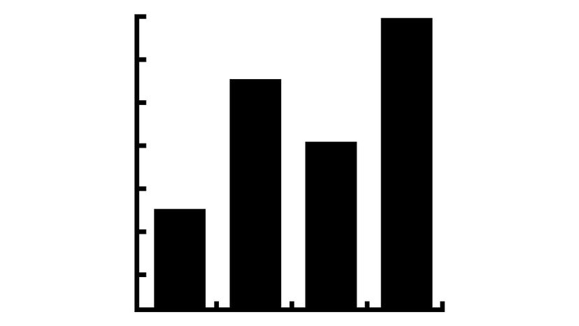
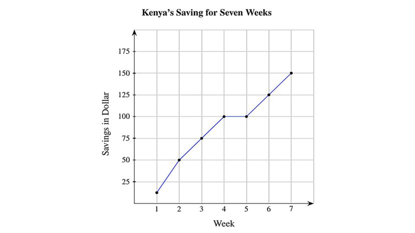
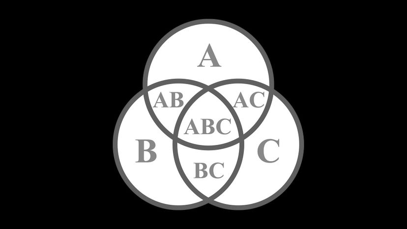
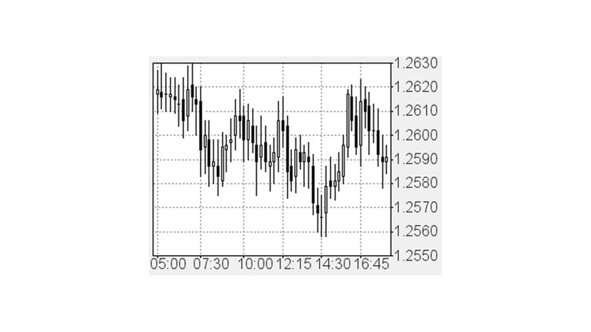
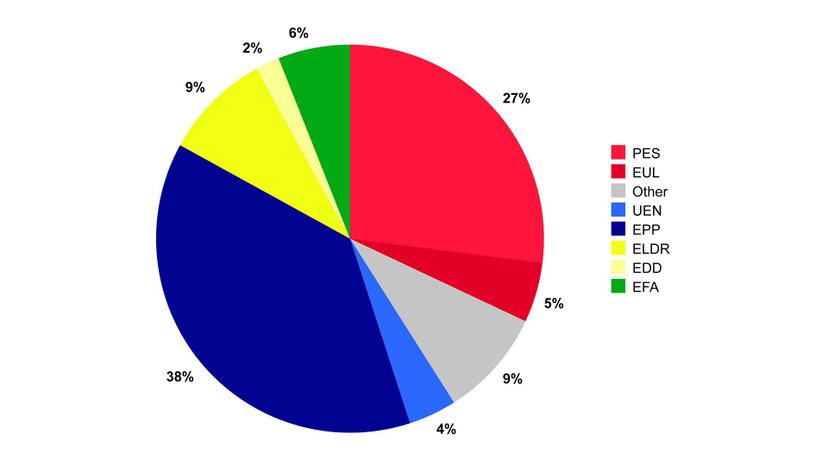
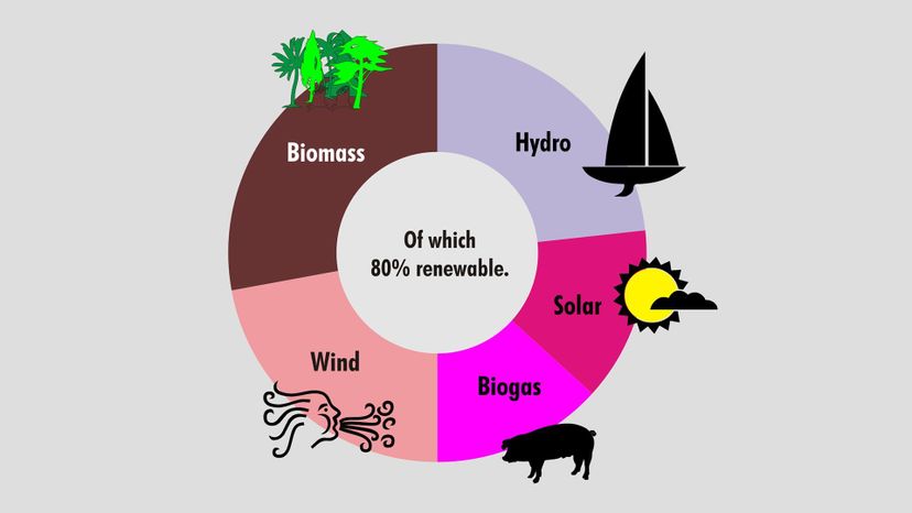
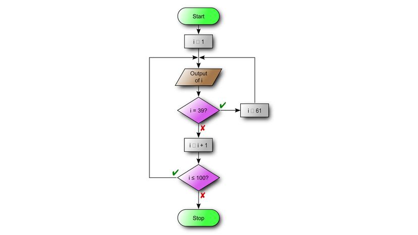
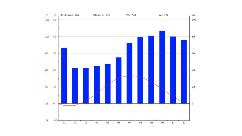
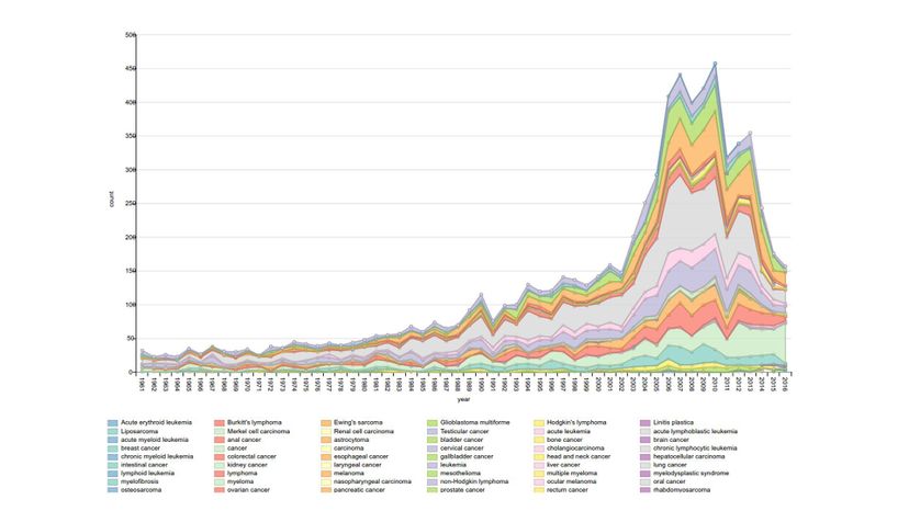
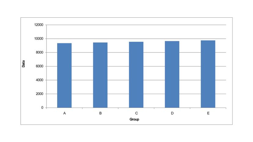
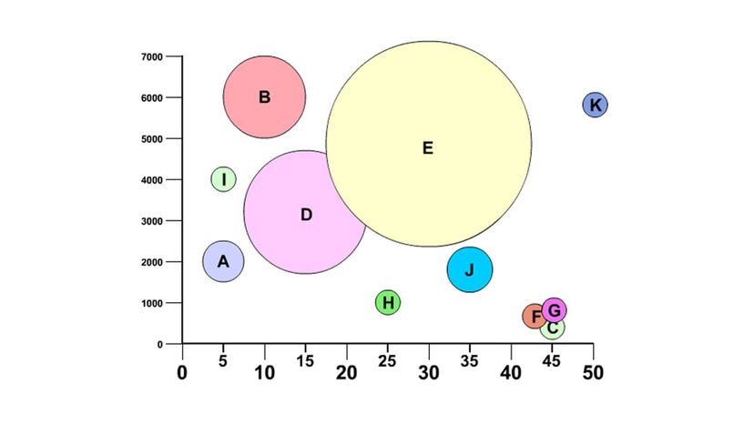
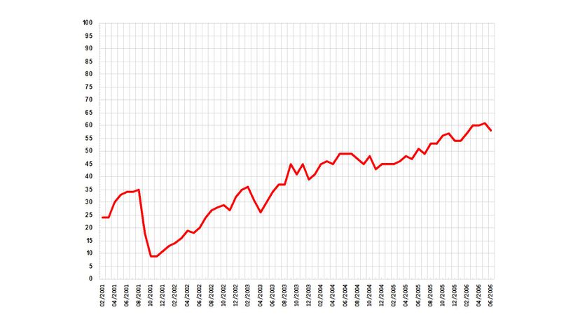
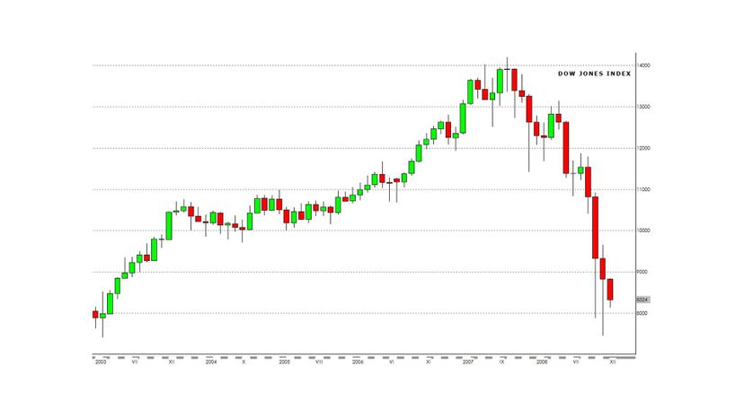
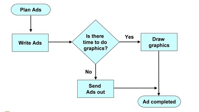
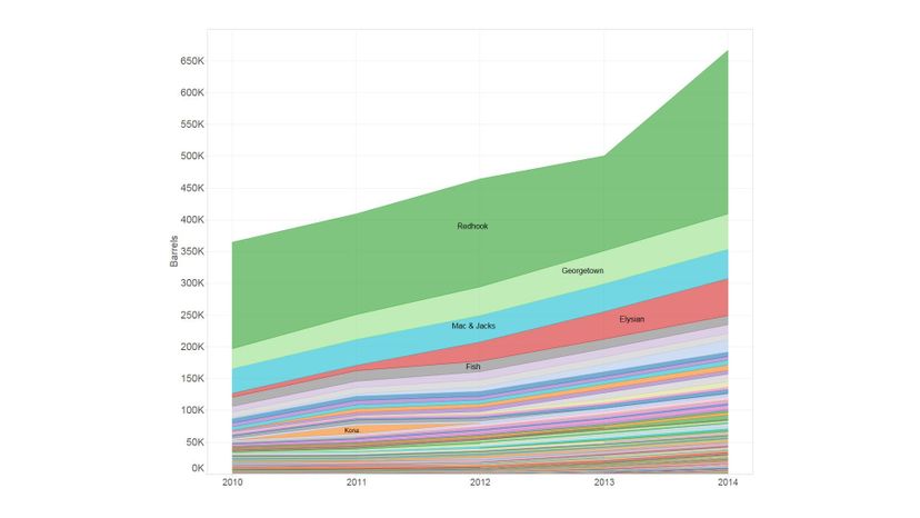
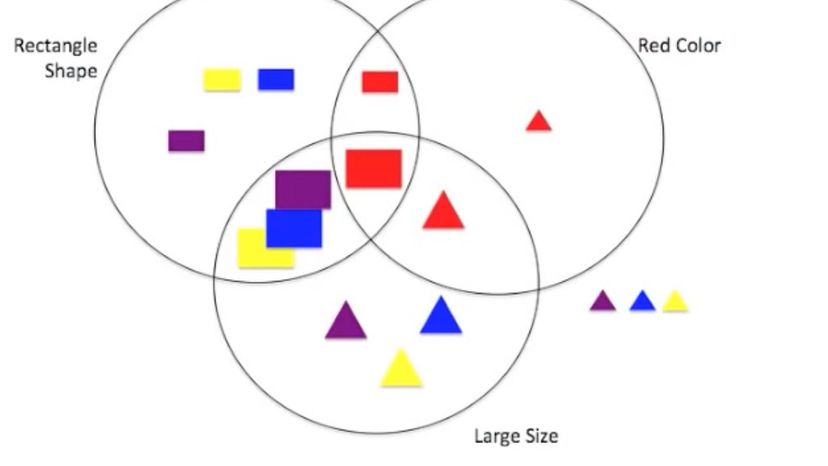
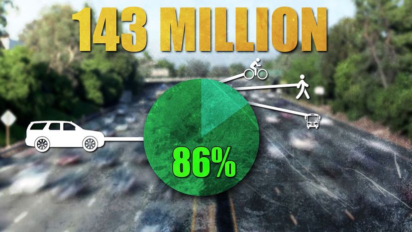
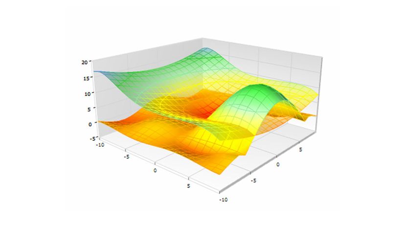
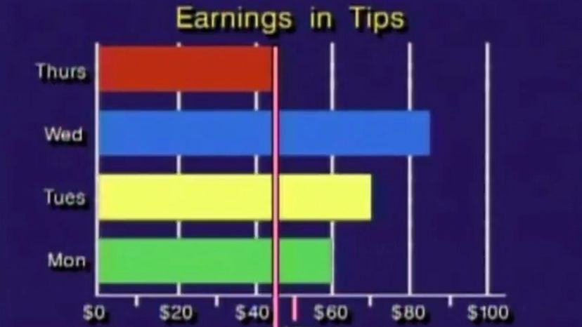
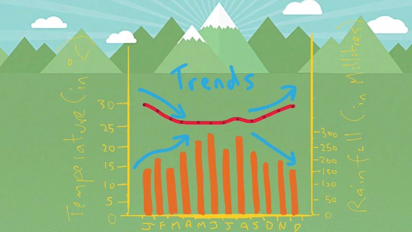
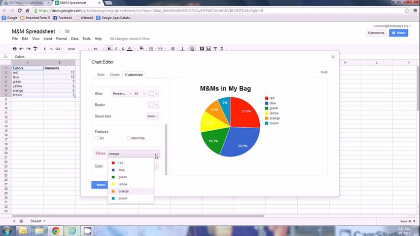
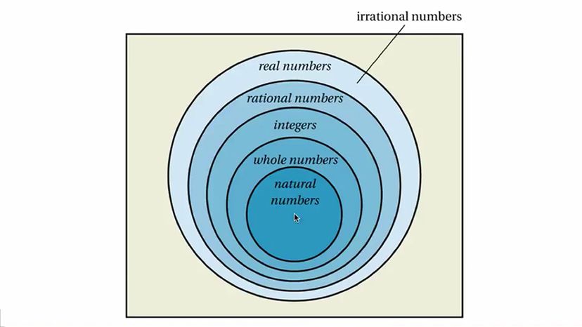
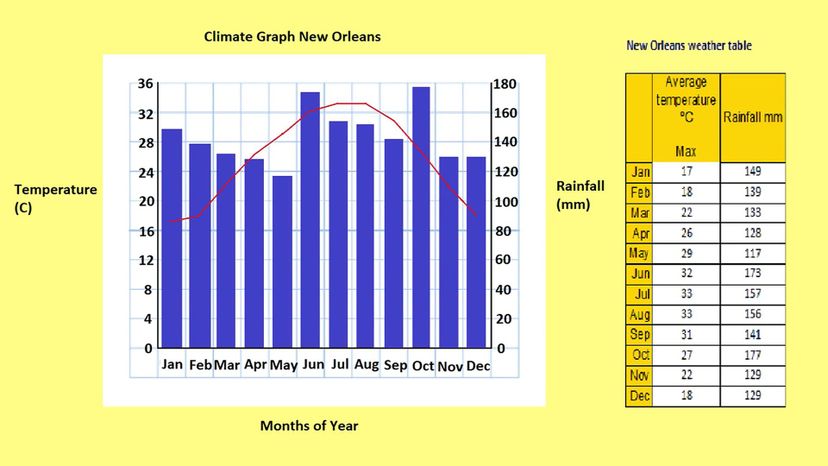
That's where good visualization can come in. If you can translate an idea into an image -- a pie chart, a bar graph, a flow chart, even the slightly more challenging histogram -- you can immediately make sense of it and convey it to others. For those of us who are especially visual thinkers, this is way more fun than wading through a huge text when we could get the same amount of information simply by distilling it into a few colors. You could expend 500 words trying to explain concepts like fractions, divisions, percentages, and fairness, or you can just put a real pie in front of them and people will instinctively get what you mean. Similarly, you can depict things changing over time, like the stock market, opinion polls, or inflation; or make projections and visualizations about the weather, climate, traffic flow, or really anything at all. So let's see how good you are at getting the right info out of an infographic!

Column Graph
Wiki Commons by Ewen
A bar graph is a type of this graph. What is it?
Column graph
This specific type of bar graph uses vertical bars to display categories of data (separate or grouped) that has been counted.
Puddle chart
Outlet graph
Controller graph

Advertisement

Bar Graph
Wiki Commons by Smallman12q
It uses columns that are proportional to the values that they represent. What are they?
Bar graph
Bar charts are a common type of graph used to indicate and compare the number and frequency of discrete sets of data.
Lace chart
Charger graph
Bucket chart

Advertisement

Scatter Graph
Wiki Commons by Innesw
It's a mathematical chart that uses Cartesian coordinates. What is it?
Scatter chart
Scatter plots are a type of graph used to find patterns and correlation between two or more variables for a set of data.
File chart
Desk chart
Button graph

Advertisement

Line_chart
Wiki Commons by Safwat.alshazly
This particular chart uses connected lines.
Line chart
Line graphs are typically used to visualize time series data; i.e., how one or more variables compare over a continuous period of time.
Window graph
Tree chart
Key graph

Advertisement

Wenn Diagram
Wiki Commons by Elecbullet
Theses charts were devised by John Venn.
Outlet graph
Lace chart
Bucket chart
Venn diagram
A Venn diagram is used to identify the similarities and differences between a finite group of items.

Advertisement

Histogram
Wiki Commons by Kwz
They were first introduced by a man named Karl Pearson. What are they?
Magnet chart
Button graph
Histograms
Histograms are a type of bar/column graph which is used when the data represented is continuous rather than discrete.
Clamp graph

Advertisement

Scatter Plot
Wiki Commons by Mdd
Their goal is to show how one variable is affected by another variable.
Can graph
Scatter plot
In scatter plots, the information about each individual or object is represented by a single dot or point, plotted on a horizontal and vertical axis.
Charger graph
Tray graph

Advertisement

Candlestick Chart
Wiki Commons by Mikhailov Kusserow/Sandbox 9
It is a combination or mixture of a bar and line chart.
Gloss chart
Candlestick chart
A candlestick chart is a type of financial chart which shows the high, low, opening and closing of security, derivative or currency.
Book chart
Remote graph

Advertisement

Pie Chart
Wiki Commons by Liftarn
It is one of the few round charts but one that is very popular.
Key graph
Controller graph
Pie chart
Pie charts, also known as sector graphs, are used to illustrate the percentage or proportion of different categories.
Puddle chart

Advertisement

Doughnut Chart
Wiki Commons by Cumeo89
It is a variation of the pie chart.
File chart
Doughnut chart
Doughnut charts are a type of pie chart, which like the former, are created with the intention to display proportions.
Outlet graph
Clamp graph

Advertisement

Flow Chart
Wiki Commons by Erik Streb
This kind of charts shows steps and their order.
Button graph
Bucket chart
Flowchart
A flowchart is a diagram which is used to outline certain aspects of a process, algorithm or workflow.
Window graph

Advertisement

Climate Graph
Wiki Commons by Climate-Data.org
This rain and temp chart is a combination of a line and bar graph. What is it called?
Climate graph
This type of graph combines the aesthetics of the bar graph and the line graph to represent basic climatic parameters.
Charger graph
Lace chart
Desk chart

Advertisement

Area Chart
Wiki Commons by Jonas Kress / WMDE
It is very similar to a line chart, but the areas are filled with color. What kind of chart is it?
Piano graph
Area chart
Area charts, which are based on line graphs, are a type of graph used to depict how one or many quantities change over a period of time.
Tree chart
Box chart

Advertisement

Column Chart
Wiki Commons by Marlita at outreach
Unlike bar graphs, this chart can only be vertical.
Remote graph
Column
Column graphs are drawn with spaces to indicate that the information displayed is separate and unrelated.
Tray graph
Camera plot

Advertisement

Surface Plot
Wiki Commons by Inductiveload
These graphs are usually shown in 3D. What are they called?
Can graph
Clamp graph
Surface graph
A surface plot is a diagram which depicts three-dimensional data. The data is comprised of two independent variables and one dependent variable.
Gloss chart

Advertisement

Bar Graph
Wiki Commons by Smallman12q
These charts can be plotted vertically or horizontally. What are they?
Key graph
Puddle chart
Bar graphs
In addition to the standard vertical bar chart, there are several variations including grouped, horizontal and stacked bar charts.
Controller graph

Advertisement

Pedigree Chart
Wiki Commons by Jerome Walker
This kind of chart has to do with phenotypes of genes.
Magnet chart
File chart
Button graph
Pedigree chart
A pedigree chart is a diagram used to show the presence and absence of a given phenotype in two or more generations of humans or animals.

Advertisement

Bubble Chart
Wiki Commons by Albin Olsson
This kind of chart has a three data series. What's its name?
Bubble chart
A pedigree chart is a diagram used to show the presence and absence of a given phenotype in two or more generations of humans or animals.
Book chart
Outlet graph
Bucket chart

Advertisement

Organizational Chart
Wiki Commons by Joxemai
This kind of chart shows hierarachy.
Organizational chart
An organizational chart is a diagram which is used to outline the internal structure of an organization.
Charger graph
Lace chart
Window graph

Advertisement

Line Graph
Wiki Commons by Tom
This kind of chart is great for showing trends.
Desk chart
Can graph
Tree chart
Line chart
This type of graph is also used to illustrate data which was measured over other continuous variables such as distance.

Advertisement

Candlestick Chart
Wiki Commons by Xvarm10
They normally show days, and each day is represented by a ...
Candlestick
Candlesticks are used to represent the trading patterns for a short time period, with each candlestick showing the price movement for one day.
Key graph
Puddle chart
Remote graph

Advertisement

Flow Chart
Youtube
It is meant to illustrate solutions to problems that are presented.
Flowchart
The steps in a flowchart are represented by various symbols which include a short description of each symbol.
Gloss chart
Tray graph
Outlet graph

Advertisement

Scatter Graph
Wiki Commons by Oxygen Project
The information is usually shown as a collection of dots or points. What is it?
Controller graph
Scatter graph
Though the points in a scatter plot are not joined, they may be circled or shaded to show the relationship between several variables.
Book chart
Piano graph

Advertisement

Histogram  22
Youtube
They estimate the probability distribution of continuous variables. What are they called?
Clamp graph
Charger graph
File chart
Histograms
One of the main differences between histograms and column graphs are the lack of gaps between the columns.

Advertisement

Area Chart 2
Wiki Commons by Dennis Bratland
They are great at showing trends, and do so much better than a typical line graph.
Window graph
Button graph
Area chart
Like line graphs, area charts are drawn with data points which are then connected to form a line.
Tree chart

Advertisement

Venn Diagram 22
Youtube
It shows how different sets of data overlaps.
Venn diagram
Venn diagrams are made up of large circles which represents a group of items with similar characteristics.
Lace chart
Bucket chart
Desk chart

Advertisement

Pie chart 22
Youtube
It has slices, hence the name...
Pie chart
This chart is comprised of a circle divided into two or more components, which is proportional to the quantities represented.
Key graph
Magnet chart
Puddle chart

Advertisement

Surface Chart
Wiki Commons by Nina.litvinenko
This type of graph always has a position, depth and value. What is it called?
Remote graph
Outlet graph
Can graph
Surface graph
Surface plots comprise of three mandatory components; depth, which corresponds to the z-axis and position and value which forms the x- and y-axes respectively.

Advertisement

Bar graph 22
Youtube
One axis shows the category, while the other shows the value. What kind of chart is this?
Bar graph
Bar charts are sometimes drawn with horizontal bars to accommodate categories with long titles, which would be difficult to fit below a vertical bar.
Camera plot
Tray graph
Piano graph

Advertisement

Climate graph 22
YouTube
It helps look for patterns in the weather or this of a place...
Controller graph
Climate chart
Climate graphs are used to show the average precipitation and temperature at a certain location throughout the year.
Gloss chart
Book chart

Advertisement

Pie Chart 33
Youtube
All of the slices in this kind of pie should add up to 100%.
Pie chart
There are several ways in which pie charts can be presented. These include exploded pie charts, ring charts, 3D pie charts and doughnut charts.
File chart
Charger graph
Clamp graph

Advertisement

Column Graph 2
Wiki Commons by YellowMonkey
Unlike bar charts, these have limited space on the x-axis.
Tree chart
Window graph
Lace chart
Column charts
The height of the rectangular bars is proportional to the values represented, which is displayed on the left side of the chart.

Advertisement

Flowchart 33
Youtube
Types of this kind of chart include document, data and program. What is it?
Flowchart
The different symbols in the flowchart are linked together by arrows which indicate the direction of the process.
Puddle chart
Bucket chart
Desk chart

Advertisement

Venn Diagram 33
Youtube
It has sets that are represented by circles.
Outlet graph
Venn diagram
In a Venn diagram, the circles are enclosed by a large box called the universal set. This represents all possible elements of any set to be considered.
Key graph
Magnet chart

Advertisement

Line Graph 22
Youtube
It is very similar to a scatter plot, but instead of points, has these straight shapes.
Can graph
Button graph
Line chart
Line graphs are typically created with data points which are then connected dot-by-dot to form a line.
Box chart

Advertisement

Histogram 33
Youtube
They are a kind of bar graph.
Camera plot
Remote graph
Tray graph
Histogram
In order to represent a large number of possible values in a continuous category, the data is divided into groups called classes or bins.

Advertisement

Pedigree Chart
Wiki Commons by Jerome Walker
This kind of chart also shows ancestors from a particular generation. What is its name?
Gloss chart
Charger graph
Pedigree chart
A pedigree chart uses squares and circles to represent males and females respectively, while a series of lines are used to represent the relationships in a pedigree.
Book chart

Advertisement

Bar graph 33
Youtube
This kind of graph was discovered by William Playfair. What kind is it?
Puddle chart
Lace chart
Controller graph
Bar
Bar charts are also grouped to represent multiple sets of data. This is done by using different shadings or colors to distinguish each sub-group.

Advertisement

Doughnut chart 22
Youtube
Like the pie chart, this kind is also named after a food.
File chart
Outlet graph
Can graph
Doughnut chart
Doughnut charts are designed with a blank center which allows for more information about the data as a whole to be added.

Advertisement

Scatter Plot 22
Youtube
If one color codes the dots on this graph, more than one variable can be shown.
Key graph
Scatter plot
The patterns of dots are analyzed to identify any systematic or causal relationship between the two variables.
Window graph
Magnet chart

Advertisement

Bubble Chart 22
Youtube
They help us understand social, medical and other kinds of relationships.
Tray graph
Bubble chart
Bubble charts are used instead of scatter charts, when the data has three categories that contain different values.
Clamp graph
Tree chart

Advertisement

Scatter Plot 33
Youtube
This kind of chart has two kinds of correlations and they are positive and negative.
Bucket chart
Charger graph
Scatter plot
In a scatter plot, the relationships between the variables are recorded as positive, negative or neutral correlations.
Remote graph

Advertisement

Pie Chart 33
Youtube
You can detach the slices in this kind of chart, if you want to make one stand out more.
Desk chart
File chart
Outlet graph
Pie chart
Each slice or section is shaded differently, with a key placed at the side, indicating the meaning of each color.

Advertisement

Climate Graph 33
Youtube
This kind of chart can show annual temperature for a certain area. What kind is it?
Lace chart
Climate
In the climate graph, fluctuating temperatures are represented by the line graph while precipitation is indicated by the bar graph.
Puddle chart
Camera plot

Advertisement

Organizational Chart 33
Youtube
They can be used as visual directories for employees.
Book chart
Tray graph
Gloss chart
Organizational chart
The chart depicts a clear visualization of the ranks and relationships of the workers within a given organization.

Advertisement

Doughnut chart  33
Youtube
Unlike the pie chart, this kind has a hole in the middle, hence its name.
Can graph
Magnet chart
Clamp graph
Doughnut chart
Doughnut charts are also designed to allow more than one category to be included in the chart. This is done by resizing the doughnut hole.

Advertisement

Venn Diagram 44
Youtube
It has terminology like union and intersection. What is it?
Key graph
Button graph
Venn diagram
The circles in a Venn diagram may be separate or overlap each other partially or completely, which indicates the relationships between the sets.
Tree chart

Advertisement

Climate Diagram 44
Youtube
It can also show average annual rainfall of a place or country.
Controller graph
Climate graph
There are three axes in a climate graph; the left y-axis represents the temperature, the right y-axis for rainfall and the x-axis for the months.
Window graph
Desk chart

Advertisement

Bar Chart 44
Youtube
Which of these graph types have stacked and clustered sub-types?
Bucket chart
Bar graph
Stacked bar charts comprise of a single column shaded into two or more sections, which represent the different sub-categories.
Charger graph
File chart

Advertisement

Area Graph 44
Youtube
This kind of colorful chart was also invented by William Playfair.
Area chart
The area beneath the lines is shaded in different colors or textures in order to emphasize the differences between the categories.
Puddle chart
Lace chart
Outlet graph

Advertisement

You Got:
/50
Wiki Commons Various